
UX Portfolio
UX Editor Michaels Stores
I served as a consultant for the Michaels UX team as the company rolled out a number of innovations including:
- In-store Self-checkout – Designed to allow customers to transact and pay for products without a cashier, I explored and tested flows, spoke to users to understand their experiences, and advised on changes.
- Third-party Marketplace – I tested to ensure quality in preparation for UAT and advised on functional and moderation frameworks to help curate the product catalog. Press release
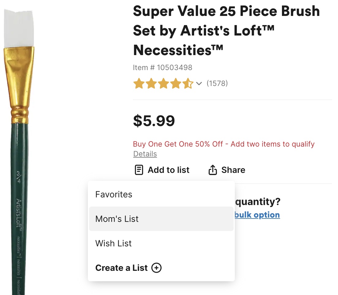
- Shareable Favorites Lists – I tested the quality, accessibility (WCAG) and performance of the experience, discovered new bugs, and recommended changes to the sharing system UI.
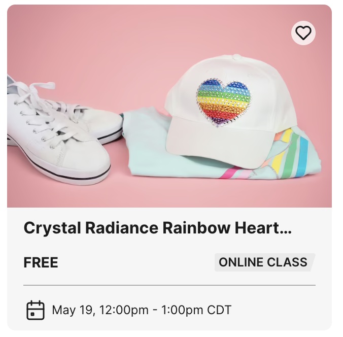
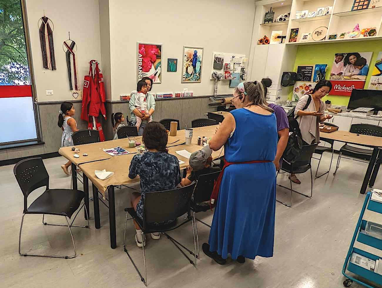
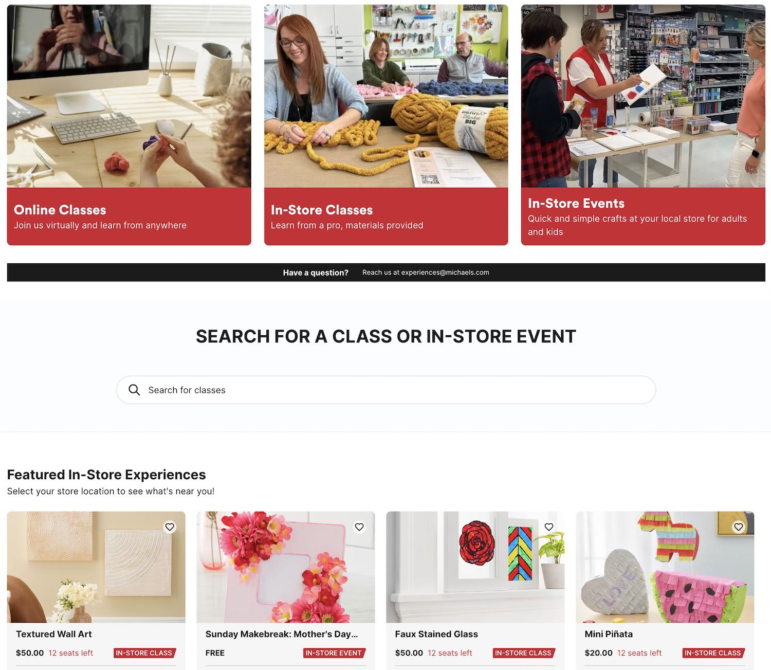
- Online and In-store Classes – I visited stores and signed up for virtual classes to understand the experience and advised on moderation. These observations helped me guide copy for the search filters.

UX Editor MakerPlace by Michaels
- E-Mail, SMS and Push Notifications – I tested and proposed copy and validated emoji readability across iOS and Android in light and dark modes. This is used for the checkout reminder system.
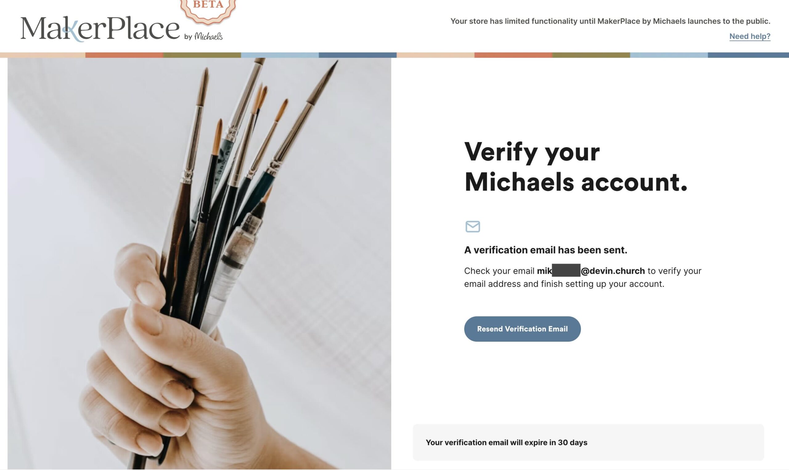
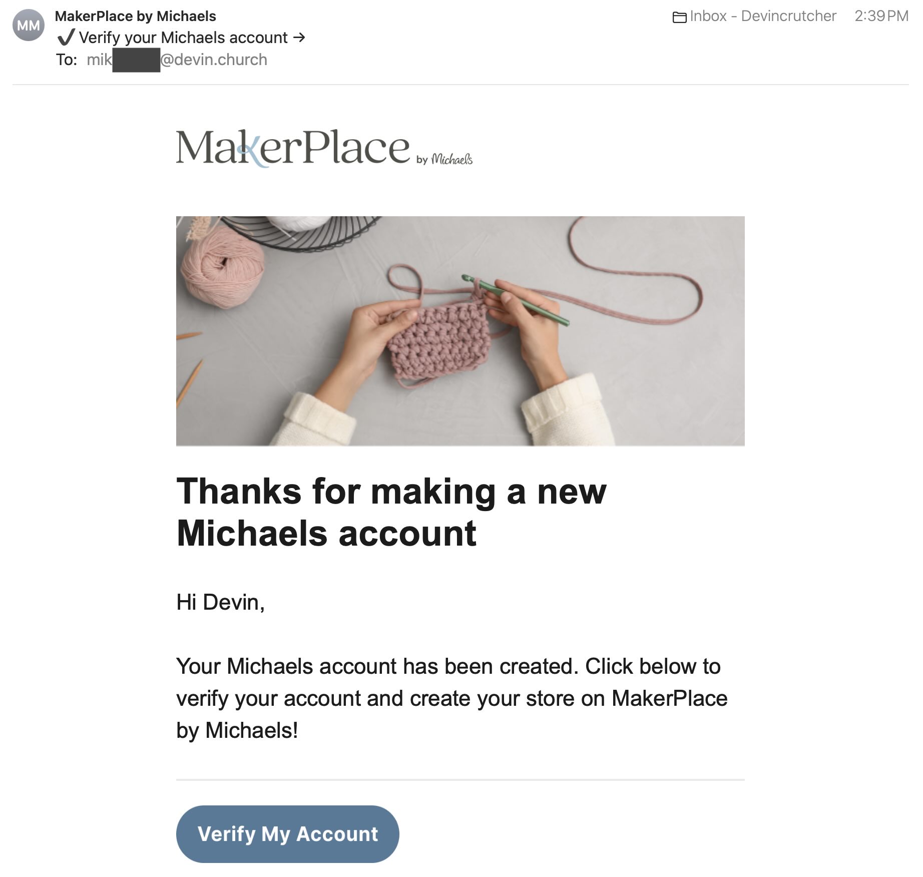
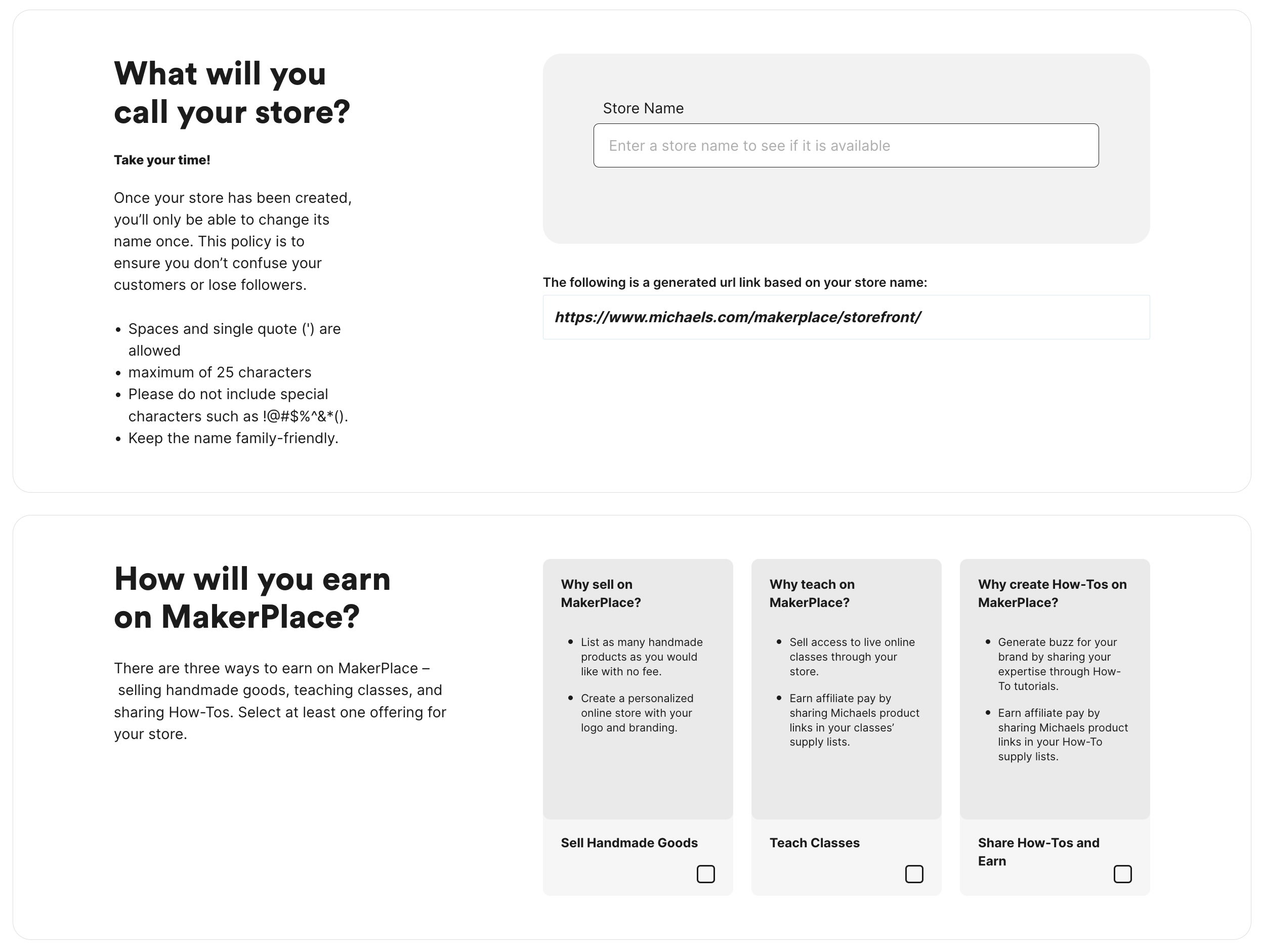
- Michaels Account Creation & Verification – Wrote or edited copy involved in the creation, verification, and configuration of new accounts used for selling in the MakerPlace Beta system, including copy on the site and received via e-mail. This flow includes new steps to improve the security of accounts and encourages users to complete their account creation. You can create a new account here.
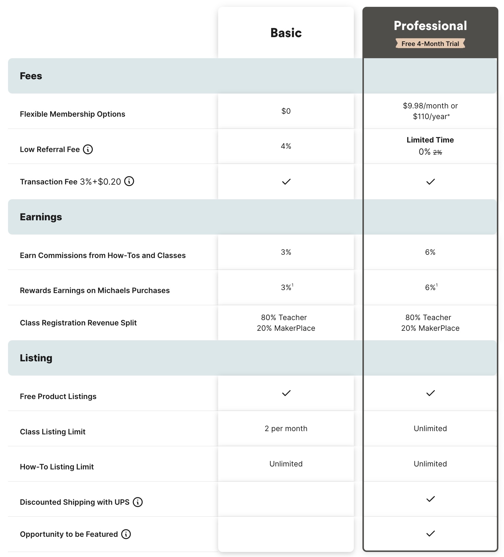
- Seller Plan Table – Provided guidance and copy recommendations for the creation of the seller plan table used to break down the Basic and Professional level plans. It’s visible at the bottom of the Become A Seller page.
- Time Away Mode – Edited the UI involved with seller Time Away mode, a feature that lets sellers take a break from the service and share a message to buyers explaining why their store is temporarily unavailable.
MakerPlace launched as a new service in August 2023. It was designed to compete with Etsy, eBay, and Facebook Marketplace.
UX Architect – Supervisory Citibank
I served as a UX writer and accessibility consultant for internal and customer-facing projects:
- NLP (Natural Language Processing) for 5 Ws – Provided UI copy recommendations surrounding an internal tool used to evaluate the precision of descriptive text to determine whether it included details about who, what, where, when, & how. This was before ChatGPT.
- Channel Services Style Guide – Provided UI copy recommendations for the style guide used by third parties to promote their services through the Citi offers sites.
- Credit Card Renew – Provided UI copy recommendations involved with the digital flow before a Citi credit card expires. Research involved exploration of existing copy in the mailer.
- Accessible ATM Redesign – Provided UI copy and layout recommendations for on-screen and screen reader copy heard by visually impaired customers. Research funding was terminated.
Citi originally said they wanted someone with experience writing tooltips, much like the ones on DallasComputer.io, but I was never asked to write tooltips.

UX Research / Accessibility / Pro Apps Apple
I served many roles during my time at the corporate campus in Austin, Texas. Some of my proudest projects included:
- Mentor for AppleCare advisors – Given my decades of experience with Apple products and training background, I was asked to mentor newly-hired advisors to support macOS, iOS, iPadOS and pre-installed apps.
- Accessibility Specialist – I was trained by Apple to support customers using VoiceOver and JAWS on Windows. Part of this training involved speaking to thousands of these customers about their experiences.
- UX Research for EMEA to AMR calls – Served as a project manager to perform root cause analysis for negative experiences. This research resulted in the creation of new policies, UI, and training modules for AppleCare advisors supporting customers outside the US.
- Advisor for Final Cut Pro – A member of the highly specialized Pro Apps team, my career experience with video and photography informed isolation and issue resolution. Certified in use of Final Cut Pro in 2017.
- Training Designer for AppleCare – Created training materials used to teach new advisors to support Pro Apps after a merger announcement. We were asked to help train our eventual replacements.
Registration Design Concept EyeInTheSky
In 2012, I designed a UI concept for a musical brand management platform. This design would allow musicians and bands to register for an account on the site without human-to-human intervention. Details about the context:
- Inspired by Tablets – The site is designed to run on iPad and indicate the potential for device rotation.
- Flat Design – Before iOS 7 and Windows 8 inspired designers to flatten their designs, this was provocative, but has aged better than anticipated.
- Indicative Buttons – Instead of simply saying [Submit], the [confirm identity> button also implies the movement to the next step.
- Step Titles – 90° rotated text for the step titles provides clues about what will happen after the button is clicked without requiring a mouseover (for a tablet) or interfering with the spatial constraints.
- Readability and Casual Type – Text is sized to maximize readability on smaller displays with minimal capitalization to maintain a more casual vibe consistent with Austin, Texas.
")
Preston & Leah Self-hosted WordPress Site
Designed in 2008 to promote the union of a couple, this site featured a number of cutting-edge methods that seem dated today:
- Integrated Photography – The title bar image was designed to place the couple front and center using my own photography and image editing.
- Earthy Colors Coordinated with Wedding Theme – Designed to match the invitations and create a more traditional look.
- Collapsible Sidebar – The sidebar was designed to collapse and expand with a patterned background.
- Rounded Corners – Back when the web site was created, each of the major browsers required its own line of code in the CSS. This made the design more tedious and required cross-browser testing.
- Dynamically-generated Cursive Titles – Browsers at the time had limited compatibility for embedded fonts and effects, so the titles had to use a special plugin to generate raster versions of the specified title using GIFs. Matching the colors with the background was trickier than it looked.
- Embedded Video – Since YouTube could only serve video 320×240, a custom, Flash-based video player was used to deliver video in 720p.
